Nina Chakrabarti
Following the interesting contrast between traditional and modern aztec in the digitally applied patterns to the Leopard experiment, I am drawn to the Nina Chakrabarti series ‘Voodoo Queens’. The illustrator has beautifully contrasted Aztec patterns against the soft and delicate skin of models, in order to attract the attention of the public with these intriguing creations.
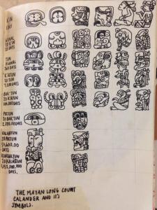
The patterns in which the illustrator uses to beautifully decorate the models faces look as though they have been informed by the more detailed tribal markings of the Ancient Aztec writing systems, such as the complex and detailed Aztec Calendar, and hand scatterings found in Teotithucan times.
For an experiment, I am going to take my favorite magazine: ‘Violet’, and give some of the pages a bit of an Aztec makeover, working in the style of Nina, and other brilliant artists who also draw on top of faces.
‘Violet’ Magazine Aztec Experiment
Nina Chakrabarti Experiment:
Although Nina uses the Magazine models faces as her canvas, she doesn’t use the the photo’s in which there is a story, to help her work go further and look more interesting.
Fashion Photography Meets Aztec Experiment:
Floral
Less is More?
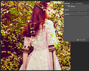
In this case, where there is an interesting busy background already, especcially a pretty floral surounding, we don’t want to completely distract; just intrigue. Floral is a very popular print at the moment, in fashion, and photography like this. The subtle, pretty contrast of the floral surroundings, compliment at the same time as contrast wonderfully with the Aztec patterns; the happy balance of modern and traditional.
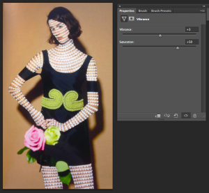
Increasing the vibrance and saturation of the image brightens and intensifies. Is this a good thing?
I think this type of design is best left subtle and intriguing, as apposed to loud and colourful.
The colder, duller image worked with the ‘nature’ of the image a lot more harmoniously.
This ‘hipster’ Topman t-shirt design is an example of fashion photography being used for platforms such as t-shirts. The contrasting monochrome image of the model, depicting an almost painful exterior and expression, is knocked out of context after this unusual mustard colour rose is placed over her mouth. The image is interesting,we are intrigued of the nature of this design. This quirky and unique contrast is what I intend to capture in my language concluding this project. I feel that I have almost found a ‘style’ to depict my interoperation and way of communicating these modern Aztec patterns to a modern audience, informed by the tradition.
Tribal Mark Experiment
Almost branding the models with symbols inspired by the Aztec calendar. This quirky design explores how interesting and magical things happen when two completely unrelated aspects or subjects are thrown together.
This image feels so natural, and would look so intriguing and fresh on a t-shirt. It’s cheeky and suggestive, oddly contrasted with the unusual out of context Aztec designs.
I edited this image to look like a polaroid photograph- inspired by the 50’s like swimming costumes. The aztec looks so effective and contrasting on the light, porcelain skin.
Zig Zag experiment
This image is really interesting. The fact that the model couldn’t be any more out of context if she tried (in relation to the Aztec period), actually works in my favour. That fact is so intriguing and strange to us that we can’t help but look, and want to learn more.
With the brightness and contrast played with, the image is now sharper and the odd zig-zags on her skin are even more prominent and peculiar. Her surroundings are another thing that are more contrasting now. I love the whole weird and wonderful vibe of this design.
This proved to be a very interesting, effective experiment. The zigzags, against the pure, light skin contrasts really nicely. I like the fact that if you didn’t know the image had any sort of reference or inspiration from the Aztec period, you wouldn’t guess, however the images still look enchanting and the viewer is intrigued as to the reason behind these peculiar designs.
This image is a part of a series called ‘Doodle Bombing’ I found by artist Hattie Stewart. Her playful and fun style reminds me of some kind of halluncinations from some kind of phchadelic drug. The marks, I can tell aren’t directly influenced from the Aztec period, but the shapes certainly remind me of some kind of inspiration from the movement.
Hattie Stewart Experiment
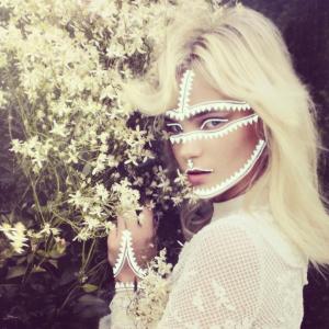
For my first experiment, I will use triangles: an Aztec shape used a lot in Ancient tribal mark making and communication systems, also a subject that has worked well in previous experiments.
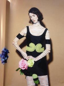
I love this design! The beauty that the photographer has captured in this moment has contrasted so well against the intriguing and unusual white Aztec inspired triangles all over her porcelain skin. The design on her dress is recognizably influenced from the period, so the image as a whole ties in wonderfully.
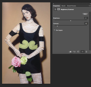
Because I felt that this design worked particularly well, I will experiment in Photoshop with how or even if I can improve the image, to better appeal to the modern Aztec theme.
The image is brighter and so much more balanced. We are attracted to the warm and vibrant colours of the image as well as the intriguing, fascinating design, appearing more prominent against her skin.
http://pitchfork.com/news/50874-listen-disclosure-when-a-fire-starts-to-burn/
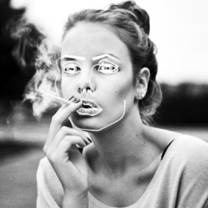
Disclosure Album Art
The Disclosure album art, found on http://pitchfork.com/artists/28790-disclosure/
I experimented with a more subtle version of the triangle experiment, informed by the subtle, detailed (yet appearing careless) use of white pen.
What I like the most about this design is the magical quality, and I wanted to really push that concept even more. I love the contrast of the light and darker aspects of the image, so, in Photoshop using the dodge and burn tools, I exaggerated these aspects, leaving the image with this sort of magical, enchanting feeling.
Teothican Writing System Experiment
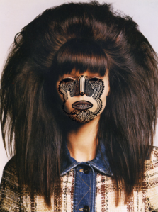
Because I thought the white pen against the skin was so affective, I decided to try and experiment with some context; maybe a theme. I chose the Teothican period to start with because the style is almost cartoon like. The face experiments I have done so far hav been quite intricute and detailed.
I chose this image because it’s less serious than the others in such a high market magazine. The effect is so cool, really unusual. I love that this image is only illustrating one period from the Aztec movement. What about a more serious photo? And another cartoon-like style Aztec period to experiment with.. What if i draw on anything but the skin this time??
The Maya Period
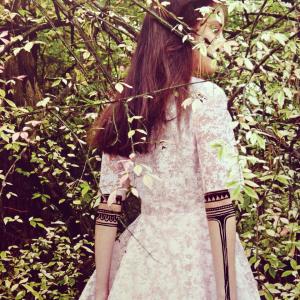
I don’t think the effect worked quite as well drawn in the background. It’s good to experiment with a bit of variety in my process, however the image doesn’t work as a whole. These types of symbols as well, don’t really work in a process like this: the symbols are too confined; they can’t work together or with the image to create an improved design; only a messy unbalanced one. These two last experiments didn’t work as well as the previous experiments in this particular process, and I really think I am beginning to come to the conclusion of this experimental project.






![CAM00589[1]](https://hannahmayartresearch.files.wordpress.com/2014/04/cam005891.jpg?w=225&h=300)
